Logos are a really fascinating part of our culture. Logo development is by far one of my favorite projects to embark upon as a graphic designer/marketing professional. A logo is a piece of marketing material that can be seen at 2 inches tall or 200 feet high that can really make or break a company forever. Look around the room you’re in. How many logos do you see from where you sit? Did you even realize they were there or have they become such an ingrained part of your consciousness that you don’t really even see them anymore? Me too. Although the main one that I see right now is one of my favorites.

I can bet you, that most 2 year olds can pick out several logos. One such logo might be McDonald’s or Chuck-E-Cheese, much to the chagrin of their parents. Clearly these companies know what they are doing though. This brings me to why I started to write this blog in the first place. Fast food.
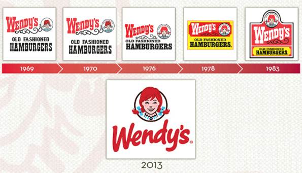
I don’t really like fast food at all. I’m a little repulsed by most of it. But the marketing is fascinating and there is one particular logo that I had been waiting on for quite some time. Wendy’s! The logo looks extremely old fashioned to me and hadn’t gone through a major renaissance of rebrand in quite some time. Take a look below:
I was pretty excited to see this new logo. It is more modern. Its fun and it keeps some consistency with the others. I was hoping to see Wendy with a more modern haircut but perhaps in the future she can. The font style is friendly and contemporary and perhaps that is the current mission of the company. Speaking of a “cut” here is what Emil Brolick, one of the company’s chief executives had to say:
“Wendy’s brand transformation is re-energizing all of our touch points with consumers,” chief executive Emil Brolick said in a statement. “We’re transforming our brand, from bold restaurant designs to innovative food that consumers want, to improved customer service. This exciting evolution of our brand reinforces our mission to position Wendy’s as ‘a cut above.’”
So maybe Wendy’s is on to something. I do appreciate a company that tries to do things different from the competition. That is what I am all about. Thinking outside the box so that my clients can have an advantage over their competitors. Logos really are the meat and potatoes of a company. And if your current logo is leaving you saying, “Where’s the Beef?” You better call me.


